
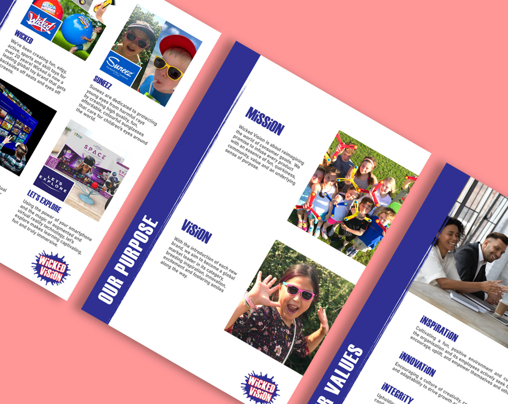
Logo Variations
Brand Colours
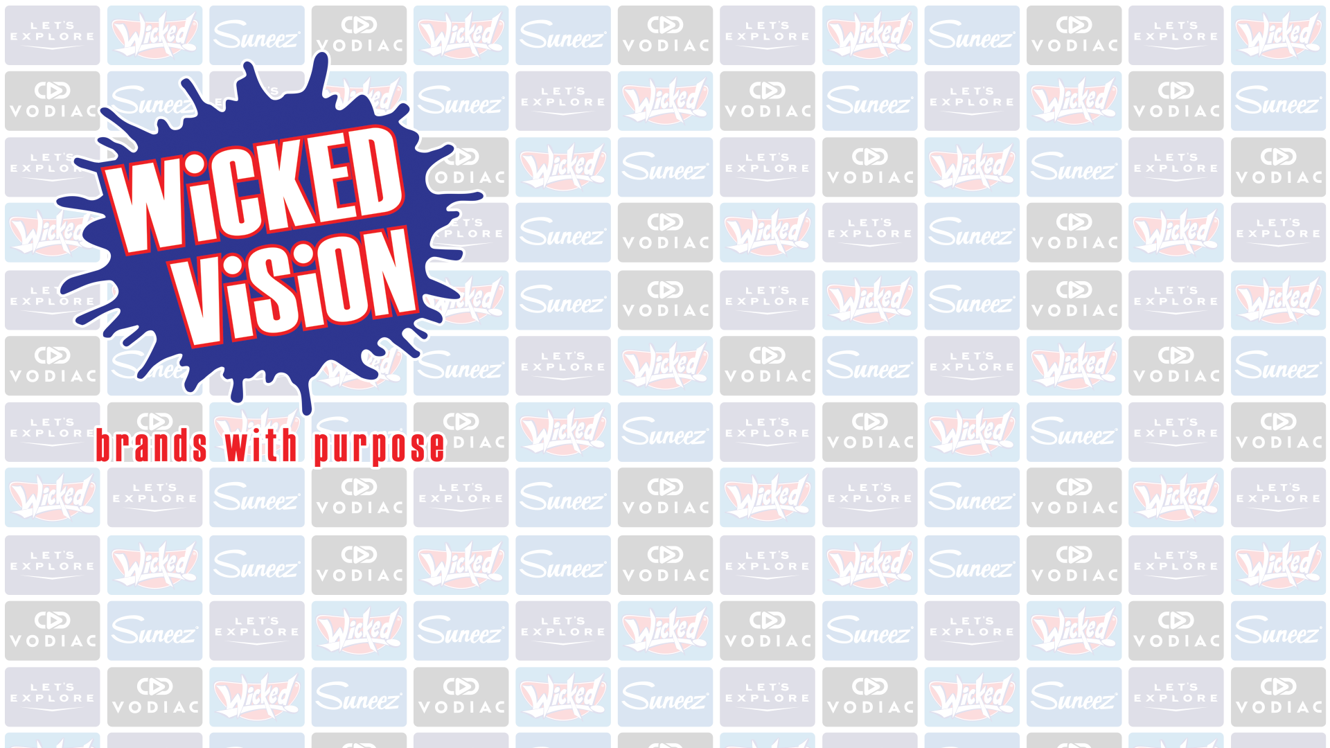
Teams Background
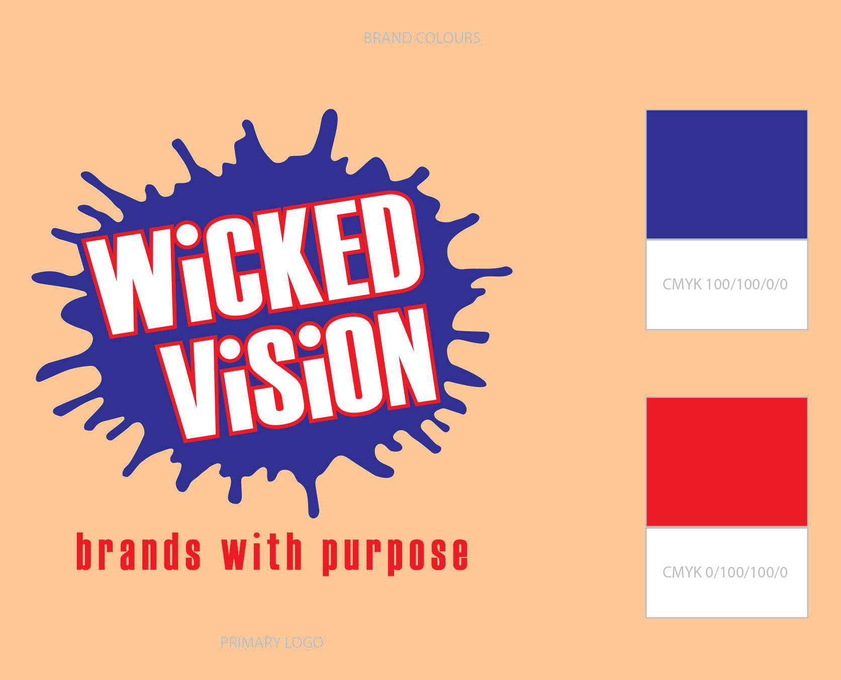
The company wanted a re-brand which included a new logo and short brochure. The brief was to create a logo using the same colour palette as the existing logo, but with a new look which evoked a sense of fun, creativity and energy. A splat shape was chosen to symbolise dynamic ideas, innovation, and a willingness to break traditional boundaries. Additionally, the organic, free-form nature of a splat creates a sense of movement and spontaneity, reinforcing the idea that the company is fresh, modern, and adaptable. Lowercase i's were used to add a quirky element, showing the playful side of the brand.